The ability to build artificial intelligence (AI) or machine-learning (ML) models is moving quickly away from the data scientist's domain and toward the citizen developer. Creating results from AI is getting easier, thanks to open-source tools that can convert AI/ML data streams into clear information that drives visualizations.
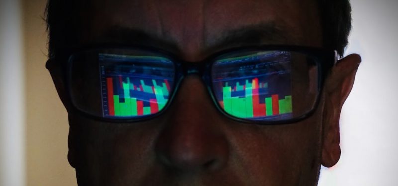
It's essential to visualize AI and ML data in a way that helps you draw insights and find trends and patterns. The quality and quantity of the data available to you are critical factors.
A visual representation should have some basic features.
One of the hallmarks of useful AI and ML applications is a highly customized, visual representation of the model that the AI expert develops. In most AI models, this feature is created through the use of graph-based neural networks. The graph consists of nodes representing the different features of a particular problem, and edges connect nodes that are equivalent or near-equivalent.
In most cases, the nodes represent data (e.g., classifications or training data) or subcomponents of a dataset (e.g., variables or data points). Meanwhile, the edges represent alternative ways of computing a function (e.g., graph-based multipliers or linear differentiation kernels).
Data experts frequently depend on their computer models' power to identify, categorize, and extract insights from multidimensional data. Such insights are often more apparent in graphs than in tabular or tabular-like data, since the visual representation of these neural networks is often more powerful and usually more easily understood.
The visual representation of the neural network should be displayed in a convenient, graphical view. Ideally, it should be understandable and easy to grasp for the user. It should make an exciting and insightful addition to the user's tool kit. That said, a graphical representation of the neural network is not always necessary. However, a user who wishes to visualize the neural network must be able to create and operate this visualization.
But being able to visualize a neural network does not mean that one needs to create an image-based neural network. For instance, some people find it preferable to visualize a neural network using a neural-network-as-a-service tool. Such tools often offer a means for visualizing the neural network at the expert level.
Here are five leading open-source solutions you can use to convert raw AI and ML data into visualizations.
1. HiPilot
HiPilot can be used for analyzing AI data and represents a fundamentally new method for visualization that is both powerful and engaging.
Many ML algorithms commonly used to train models have been developed in essentially the same way: Learning algorithms are fed large amounts of labeled data. The label is used to define the classification process of the data.
HiPilot allows data to be annotated in such a way as to have metadata embedded in it. This metadata is then plotted on a new type of visualization to be defined by the data. You can rotate the data in any direction, zoomed in on it, and manipulate it in other ways, as well as augmenting it with additional color, text, video, etc.
HiPilot is widely used in the data science space, with companies including Facebook, Uber, Google, and Microsoft among the adopters so far. Many companies use it for fact gathering as well as analyzing and for making inferences based on data. In the face of growing ML data and the difficulties of labeling it, HiPilot can help gain new insights into data.
2. Orange3
Using Orange3 to visualize AI data requires you to access the needed technologies to perform analytics and develop dashboards. Orange3 itself doesn't have a visual drag-and-drop user interface. However, if you download an add-in for your Python IDE (such as PyCharm or Eclipse), the script will show up as an API. To use it, you first install the add-in and then create a quick project. With this tool, you can build a visualization on any connected Python platform.
Orange3 is the right choice for organizations that already rely heavily on Python-generated code.
3. D3JS
D3JS allows AI/ML data to be visualized with CSS and JavaScript. D3JS visualizes the output of deep neural networks with stacked plots and overview graphs.
The D3JS functions below will allow you to integrate D3JS with artificial neural networks.
The following code shows how you can create a plot of the preprocessing cost (green) against the model accuracy (red). You can do a one-liner to plot the cost versus accuracy.
var nodes = lons.lons

var rownames = {"id": id, "error": error, "preprocessing": preprocessing, "model": model, "preprocessing_error": preprocessing_error}

lons.select(nodes).plot([nodes.nodeID,'-x-', nodes.pointWidth, '-y-')].plot({

topcenter: '\(\theta_n, \theta_1'}).set('fill')a

})
You can visualize the network's outputs by creating a profile visualization with points (x, y). You can use SVG (scalable vector graphics), CSS (glue code to stick the labels on the points), and JavaScript to create the pictures.
D3JS is the go-to tool I use when I need to visualize ML data quickly. The easy access to the library through JavaScript and CSS makes it accessible to both Web designers and data scientists.
4. Facets
Aligned with the PAIR initiative (Google's People + AI Research program), Facets is an open-source visualization tool that can help you understand and analyze ML datasets. The Facets project includes two visualizations for understanding and analyzing such datasets: Facets Overview and Facets Dive.
The visual representation is implemented as a Polymer web component, developed with Typescript, and can be embedded into Jupyter notebooks or web pages.
Facet uses ML to interpret your neural network data and a generative adversarial network (GAN) to create images based on the feedback it receives from your model. It allows you to iteratively develop a model without forcing you to wait for an arbitrary number of iterations to improve a model's performance.
It can help you analyze your data in ways that will make it easier to evaluate your AI and develop the technologies that can help drive your models' advancement.
5. TensorWatch
TensorWatch offers many tools, including debugging, but what stands out is its ability to visualize data streams. The TensorWatch agent interface has become a standard set of tools for visualizing, understanding, and testing AI systems. The agents help train these systems on various tasks and are most commonly used by end users to test system performance in an anonymized environment.
TensorWatch supports several training technologies, including FaceNet, ResNet, Inception, and NormNet. And the platform now includes an interface for training virtual agents that works by gathering model training data through an image from a webcam, allowing the user to see the virtual agent's behavior as it runs.
TensorWatch implements the Microsoft Cognitive Services platform. If you are already using Azure services, then TensorWatch is the right solution for you.
Adapting tools to create actionable insights
While nothing can yet replace human insight, there are a few approaches available.
First, just like humans, data scientists need to interact with their data and interpret them. They need to build powerful visualizations that clearly illustrate the data and show the valuable relationships. This involves a combination of ML and human subject-matter experts (SMEs).
A prominent example, Google's Exponator, uses ML to identify which publications contain relevant citations for a given topic. This eliminates the need to rely on the efforts of human SMEs and instead makes those analysts more effective.
But even as human insights are being replaced, humans need to have the tools to look deeper and search for meaning in data. To do this, ML needs to be paired with domain experts who can interpret and make use of the data. Human analysts can now focus on drawing out logical conclusions from the data instead of having to spend their time parsing the data.
A second approach is to use AI to enhance data analysis. For example, you might combine AI with knowledge-based research. A human SME may see that a team of employees in marketing performs well and may also see that the group has adopted an agile approach. Human SMEs may also use domain experts' tools to understand what this means for an organization and use this information to make an informed decision about personnel, tools, budgets, or resources.
AI can also work with domain experts to go beyond merely ranking individuals and teams in order to build models that improve the company's products and services.
Finally, data visualization can be personalized based on the goals of the data scientist or the user. An example of this is Tableau Public, a free tool that leverages ML to offer users a dynamic dashboard customized to their needs. This dashboard gives users access to a stream of automatic triggers based on their activities and workflows.
For example, it can display when you reached a certain quota or even link to your organization's budget. This can help users to become more aware of the costs of their decisions and in order to make better-informed choices that make the most of their time and resources.
The challenges of visualizing data
Visualizing data is an important activity and requires more effort than doing the same process in Excel or Microsoft Paint. The key challenge in visualization is often correctly defining data concepts, as visualizations of multiple dimensions or multiple pieces of data require a thorough knowledge of each one.
Data visualization has recently gained a lot of attention in the business and analytics communities. Many companies are experimenting with it in their everyday operations, trying to make sense of vast amounts of data.
Keep learning
Get up to speed fast with TechBeacon's guide to the modern data warehouse.
Download the Buyer's Guide to Data Warehousing in the Cloud.
Get up to speed on digital transformation with TechBeacon's Guide.
How important is digital transformation to your org? Take our survey and find out how you stand next to the competition.
Thinking of making a change? TechBeacon's Careers Topic Center provides expert advice to prepare you your next career move.
